
Comparing Kernel Density Estimation and Census Tract Aggregation for Tobacco Retailer Density in Colorado
Problem Description
Researchers often aggregate point-level data, such as tobacco retailer locations, into administrative units (e.g., census tracts or counties) for mapping and statistical analysis. However, aggregating point events into polygon units can introduce bias and create misleading interpretations. People do not encounter census tract boundaries as they move through the built environment, and events occurring near borders may be under or overrepresented when aggregated into discrete units. These issues are compounded by the Modifiable Areal Unit Problem (MAUP) (i.e., the established sensitivity of spatial analyses to the scale and configuration of areal units) which can bias both descriptive maps and statistical models. For this project, I evaluated how methodological choice influences census tract level estimates of tobacco retailer density. Specifically, the analysis addressed: 1) Which census tracts exhibit the largest discrepancies, and what spatial patterns characterize those differences? and 2) How do tract level tobacco retailer densities differ when calculated using fixed-bandwidth Kernel Density Estimation (KDE) versus simple areal aggregation?
Analysis Procedures
The analysis used three data sources: 1) licensed tobacco retailer locations obtained from the Colorado Department of Revenue, 2) Colorado census tract boundaries, and 3) Colorado state boundary files. Retailer records were cleaned, geocoded, and projected into the Colorado State Plane coordinate system.
First, I generated a fixed-bandwidth Kernel Density Estimation (KDE) surface in ArcGIS Pro using the Kernel Density tool and a quartic kernel function. The analysis used geocoded tobacco retailer locations, a 2,414-meter (1.5-mile) bandwidth, and a 100-meter cell size. I selected the bandwidth based on evidence that tobacco users typically reside 0.4 to 1 mile from their preferred retailer, while also accounting for Colorado’s large rural areas and statewide study extent (Doogan et al., 2018). Second, I converted the continuous KDE surface to tract-level estimates using the aggregated intensity approach described by Brooks et al. (2022). Then, I multiplied the density values by cell area and summed within census tracts using zonal statistics to estimate the KDE-derived number of retailers. For comparison, I calculated observed retailer counts using a spatial join between retailer locations and census tracts. Third, to quantify the difference between the KDE-derived estimates and observed tract-level counts, I calculated the relative percent difference for each census tract as outlined in Brooks et al. (2022). This metric characterized how much the KDE estimates deviate from the simple observed counts and highlights where tract-based counts under or over represent true spatial accessibility.
Results
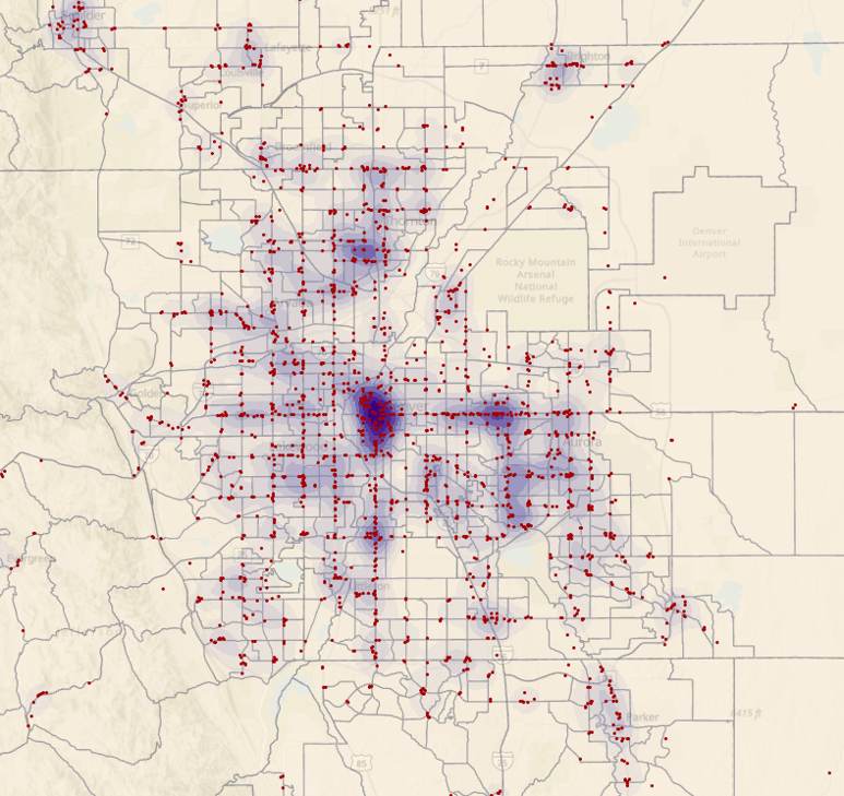
Figure 1. Kernel Density Surface for Tobacco Retailers in the Denver Metropolitan Area (Census Tracts; 100m Resolution)
The calculated aggregated intensity values represent the KDE-estimated number of retailers within each tract while accounting for cross-boundary influence from nearby retailers. By accounting for spatial influence across nearby locations, KDE can reduce boundary effects and provide a more representative depiction of retail environments. Using simple aggregation, I found that census tracts contained between 0 to 21 retailers, with a median of 3. KDE aggregated intensity values ranged from 0 to approximately 21.5, with a median of 2.97, which closely matched the statewide summary level but often differed substantially tract by tract. Figure 1 (left) displays the KDE surface (100m resolution) for the Denver metropolitan area. Darker purple areas represent higher KDE-estimated density, while the red points show actual retailer locations.
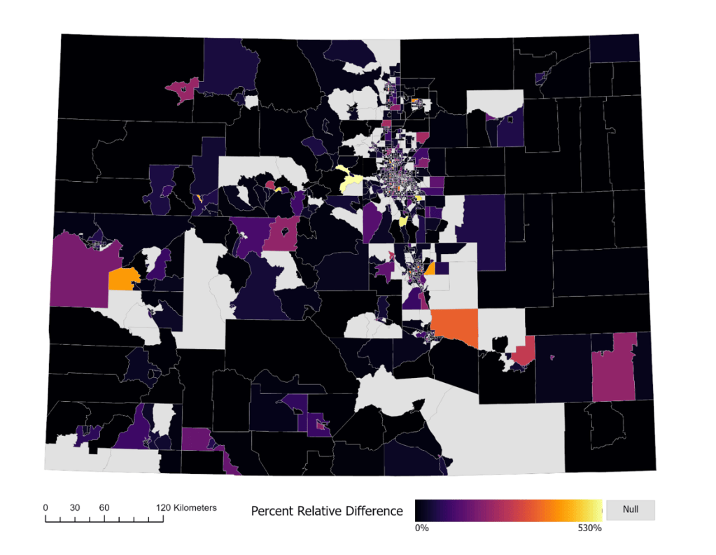
Figure 2. Percent Relative Difference per Census Tract in Colorado
Results in Figure 2 (above) illustrate that methodological choice substantially influences density estimates. I found that simple census tract counts often underestimating retailer density compared with fixed-bandwidth KDE aggregated intensity, particularly in urban and suburban areas. The median tract-level difference between methods was 32%, which underscores the importance of accounting for cross-boundary influence when measuring tobacco retailer exposure. By reducing reliance on arbitrary administrative boundaries and mitigating one dimension of the Modifiable Areal Unit Problem (MAUP), aggregated intensity provides a more spatially realistic representation of retailer accessibility. These improvements may strengthen policy evaluation, equity assessments, and the targeting of tobacco control interventions. Future research should evaluate adaptive or network-based KDE approaches and incorporate population-standardized measures to further refine estimates of tobacco retailer exposure.
Reflection
Through this analysis, I gained a deeper understanding of how methodological choices influence measures of spatial accessibility and exposure. The aggregated intensity approach demonstrated several advantages over simple tract-based counts by incorporating information from nearby retailers regardless of tract boundaries, helping to mitigate one dimension of the Modifiable Areal Unit Problem (MAUP). The method was particularly valuable in areas where census tracts contained relatively few retailers but were located near clusters just outside tract boundaries, suggesting that count-based measures may underestimate true exposure. The project also highlighted the importance of bandwidth selection, as KDE results are highly sensitive to the chosen smoothing distance and should be informed by both empirical evidence and study context.
This project reinforced the importance of critically evaluating spatial methods rather than relying solely on conventional aggregation approaches. Although aggregated intensity can provide more realistic exposure estimates, it remains subject to limitations, including sensitivity to bandwidth selection, reliance on Euclidean distance, and the inability to account for population, transportation networks, or physical and structural barriers that influence accessibility. In future work, I would evaluate multiple bandwidths, explore adaptive or network-based KDE approaches, and incorporate population-standardized measures to improve estimates of tobacco retailer exposure across diverse urban and rural settings.
Identifying Spatial Patterns of Educational Attainment in North Carolina
Problem Description
For this project, the North Carolina (NC) Department of Education needed educational attainment data to assess the socioeconomic conditions of NC’s population and to guide funding allocation, program planning, and implementation. School districts receive funds to offer basic skills classes for adults without a high school diploma or GED. To target these funds, the Department needed two products:
- A map of the raw number of adults aged 25 and older in each census tract who completed 12th grade but did not receive a high school diploma.
- A Getis-Ord GI* analysis to identify statistically significant hot and cold spots of low educational attainment at the census tract level.
Analysis Procedures
For this project, I used two input datasets from the US Census Bureau: 1) polygon boundaries for NC census tracts from the TIGER/Line shapefile repository, and 2) census tract educational attainment for the population aged 25 and older, from the 2015–2019 5-year American Community Survey (ACS). The variable of interest was B15003_016E, the number of people who completed 12th grade but received no diploma. After acquiring the data, I cleaned the tabular data and joined it to the tract boundaries.
I analyzed the data in ArcGIS Pro using spatial pattern and cluster analysis tools (Figure 1). I calculated the Gi* statistic to see where high and low values of low educational attainment clustered. To calculate the Gi* statistic, I used the “Hot Spot Analysis (Getis-Ord Gi*)” tool. I used a local calculation because I wanted to identify 1) if there was any spatial clustering, 2) where the spatial clustering was located, and 3) the locations of hot and cold spots of statistically significant clusters among the data. I set the conceptualization of spatial relationships to “contiguity edges corners” since my input features were polygons which shared boundaries. This meant that census tracts which shared an edge or a corner with each other were likely included in computations for the target census tract.

Figure 1. Project Workflow Diagram.
Results
To visualize the data, I developed a choropleth map (Figure 2) which shows the raw number of people in each NC census tract who completed 12th grade but did not receive a high school diploma. Census tracts with dark teal shading indicate areas with low educational attainment.
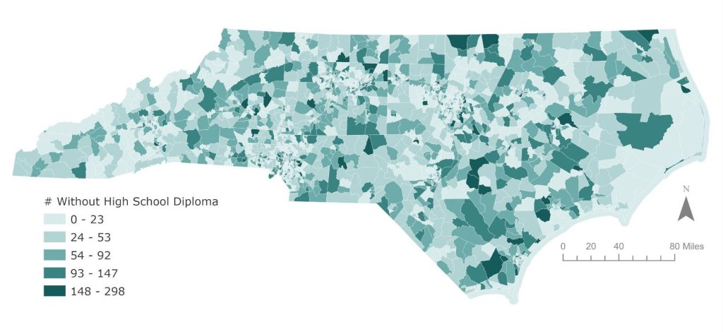
Figure 2. Choropleth Map of Educational Attainment in NC.
Once the Gi* statistic was calculated, I created a map (Figure 3) based on the Gi Bin value which represented the z-scores and p-values where features with low educational attainment clustered spatially. These areas appear to be distributed fairly evenly across the entire state.The z-scores and p-values outputted by the Gi* statistic measure the statistical significance and indicate that I could reject the null hypothesis—there was observed spatial clustering of high or low values that was more pronounced than expected in a random distribution of the same educational attainment values. In Figure 3 (below), the dark blue areas on the map represent a clustering of census tracts that contained low numbers of people who did not receive a high school diploma but completed the 12th grade; these areas indicate most likely areas of high educational attainment. The red areas on the map represent a clustering of large amounts of people with low educational attainment. Clusters of hot spots of high numbers of people who did not receive a high school diploma were present in the more rural, eastern parts of the state. There were several cold spots scattered throughout the urban cores in the state- particularly in the Charlotte, Winston Salem, Greensboro, and RDU areas. Surrounding the urban cores were also census tracts with hot spots. These results could be helpful to the Department of Education so that they can target adult education classes or funding to the red-hot spot census tracts on the map.
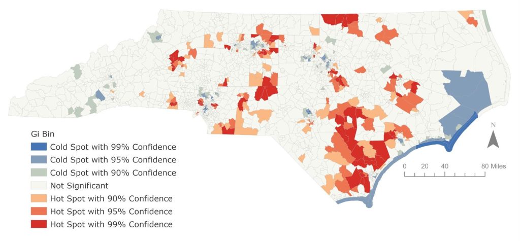
Figure 3. Map of Spatial Clustering of Low Educational Attainment in NC.
Reflection
In this project, I gathered, cleaned, and analyzed US Census data to identify where low educational attainment clusters in NC. A first step in many projects is to review the data, and choropleth maps of a study population are useful to show where counts appear high and low, but it cannot show whether patterns are statistically meaningful. Therefore, the Department wanted to use cluster analysis because it could give the Department statistically significant evidence for deciding where to direct their limited resources. Comparing choropleth map of raw counts and the Gi* map showed me the value of cluster analysis. Low educational attainment looked evenly spread on the descriptive map, but the Gi* results revealed significant clusters that the choropleth map alone couldn’t show. I also learned the importance of choosing the correct spatial relationship and how this can impact analysis. I also learned the importance of reviewing sample size before running an analysis. For example, on the far coastal region in Figure 3, there were clusters of cold spots on the coast which are likely attributed to low populations. In future analysis, I will consider dropping observations if the sample size is too small. Additionally, in the future, I would also use rates rather than raw counts for the Gi* analysis so that hot spots reflect actual need instead of larger populations.

