
Building an Enterprise Geodatabase of Fish Data within US National Parks
Problem Description
For this project, the National Park Service (NPS) needed an inventory of fish populations within and around the park units. This requires a database that could support current and future management by documenting inventory site locations, each visit to those sites, the game and non-game fish observed, along with their associated metrics. Using five text-file datasets provided by the instructor, I designed and built a multi-user enterprise geodatabase to store and relate these data.
Analysis Procedures
Building a geodatabase starts with an Entity-Relationship (ER) diagram. This diagram shows the entities, their attributes, any special characteristics of each attribute, and the relationships and cardinalities between entities. Figure 1 shows the ER diagram I developed for this project. The five rectangles are the entities, one for each text-file dataset (e.g., Sites, Visit Event, Game Fish, Non-Game Fish, Species Taxonomy). Ovals denote attributes, and the green diamonds show the relationships between entities, including the direction of the relationship.
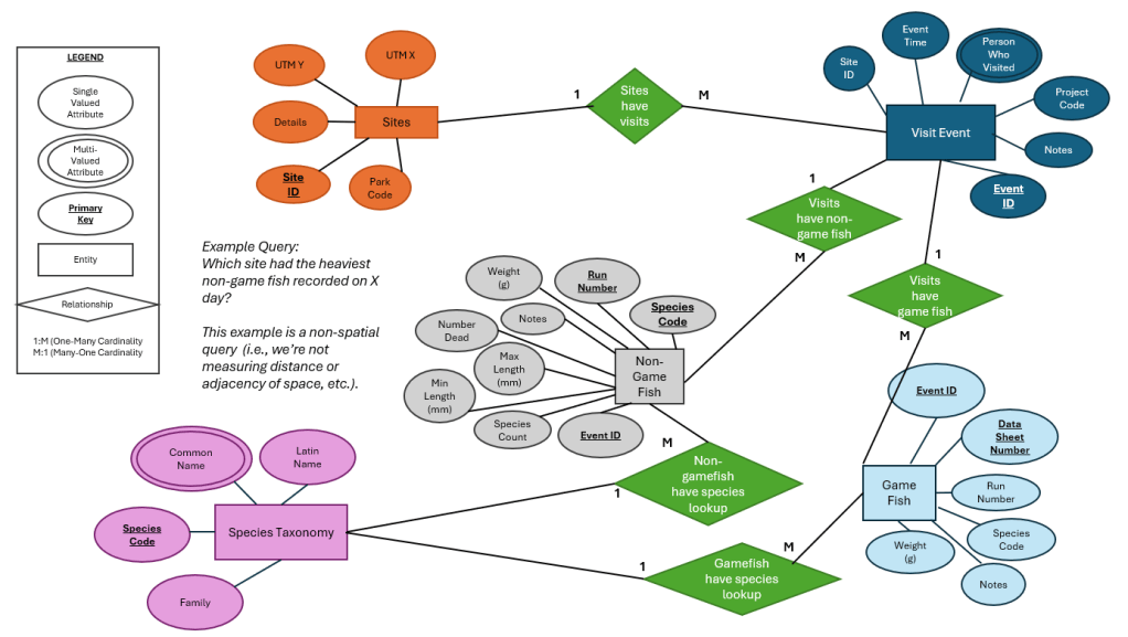
Figure 1. ER Diagram of Fish Data within US National Parks.
Next, I turned the ER diagram into a Unified Modeling Language (UML) diagram in Dia, which defined the tables, fields, data types, and keys for the database (Figure 2). From the UML diagram, I used Perl to generate Data Definition Language (DDL) statements, then ran them in pgAdmin to create the PostgreSQL database. Next, I populated the tables with the text-file data using Structured Query Language (SQL). Finally, I enabled the database as an enterprise geodatabase and connected to it in ArcGIS Pro so the site locations could be stored and displayed as spatial features.
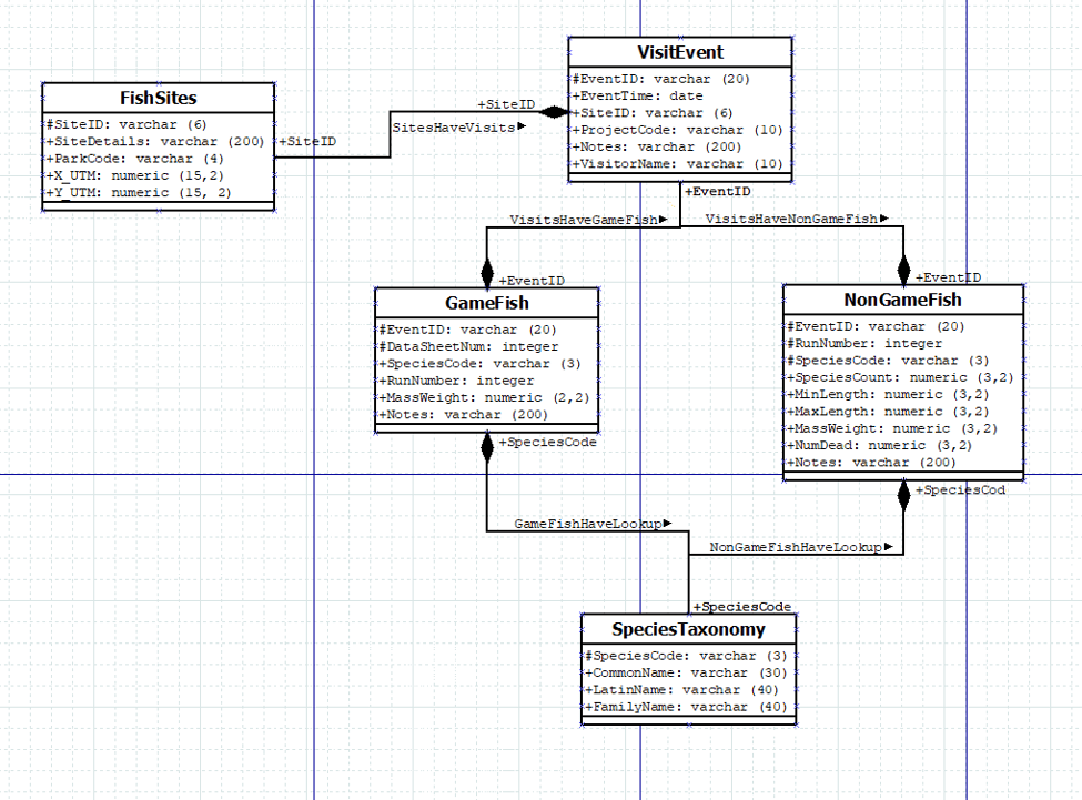
Figure 2. UML Diagram of Fish Data within US National Parks.
Results
The finished geodatabase stored the fish inventory data in related tables. Users could link each inventory site to its visits and to the fish observed on each visit. The benefit of creating the enterprise geodatabase was that multiple people could access the database at the same time. Also, an enterprise geodatabase simplifies the process of adding new data; data can be added manually or by using an “INSERT” SQL statement.
Reflection
This project taught the importance of planning and preparing to design a functional database. Creating the ER diagram first made me think through how sites, visits, and fish observations relate to each other before writing any code, and that made the later steps much more straightforward. Moving from the ER diagram to UML, DDL, and then using SQL also showed me how each step builds on each other. Generating the DDL from the UML diagram made the process replicable and cut down on manual errors. A well-structured, multi-user database allows multiple people to access and query the data, which is valuable for long-term programs like NPS fish monitoring. I plan to use the same design-first approach when building databases for my future public health work, as it is important for related data to remain up to date, for multiple people to be able to access and query the data, and to be able to easily make data updates.
File Geodatabase Development for Mapping Tick Populations & Tickborne Disease Incidence in the Continental US
Problem Description
Tickborne diseases are a growing public health risk across the United States. The CDC collects county-level data on blacklegged tick populations and tickborne disease cases. However, these data come from a variety of surveillance systems, cover different years, and are released in different table formats. The goal of this project was to organize these datasets in a single file geodatabase, link them to county boundaries, and use the resulting feature classes to map tick populations and disease risk. I then shared the maps in a public ArcGIS StoryMap. Readers could use it to check whether the places where they live or plan to travel have established tick populations or high rates of tickborne disease, and learn how to take precautions to protect themselves.
Analysis Procedures
For this project, I downloaded three datasets. First, I used the County-level 2023 surveillance status for Ixodes scapularis (blacklegged tick) and Ixodes pacificus (western blacklegged tick), from the CDC as a tabular dataset. Then, I downloaded the Tickborne disease case counts by county for 2019–2022, from the CDC’s National Notifiable Diseases Surveillance System as tabular dataset. Lastly, I obtained the county boundary shapefile from the National Historical Geographic Information System.
I prepared all the data in ArcGIS Pro. First, I created a file geodatabase to store all the project data in one place. Then, I imported the county boundaries as a feature class. The source datasets from CDC were tabular, came in different formats, covered different time periods, and had separate records for each tick species and disease type. For each dataset, I standardized the county identifiers (i.e., GEOID), and I joined the tick status and disease case tables to the county feature class using GEOID. Then, I calculated the disease incidence per 100,000 people, with the 2020 county population, so that counties of different sizes could be compared. The last step of the data management process was exporting the joined results as new feature classes into the file geodatabase so the joins became permanent.
Results
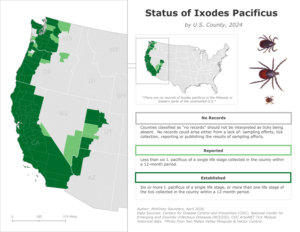
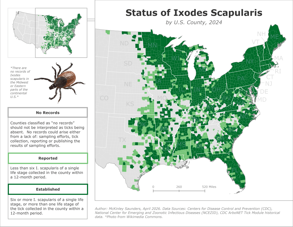
Figures 1 and 2. Tick status by US county (select an image to enlarge).
The final file geodatabase brings together county boundaries, tick surveillance status, and disease incidence data. From the geodatabase layers, I created thematic maps to present the information. Figures 1 and 2 (above; use the arrows on the image to view one at a time) shows the tick’s status (no records, reported, and established), and Figure 3 shows the disease incidence per 100k population by US county. I used a discrete green color scheme to identify which counties carry risk. Since this tool was intended for a general audience, each legend also included additional information to interpret the visualization. For example, the legends in Figures 1 and 2 note that “No Records” reflects missing surveillance data, not the absence of ticks. I exported the maps as static images, added them to an ArcGIS StoryMap with supporting text and graphics, and published it publicly through ArcGIS Online. The published StoryMap (See the full StoryMap here) presents the results as a quick reference tool.
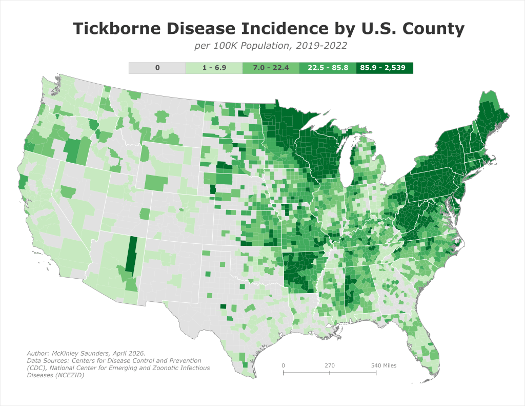
Figure 3. One of three thematic maps developed with the data.
Reflection
For this project, I combined several CDC surveillance datasets into one file geodatabase to map tick populations and tickborne disease risk across the continental U.S. I had to standardize county identifiers, combine the multi-year case counts, and normalize the counts by population before the data could be joined and compared reliably. Keeping everything in a single file geodatabase made the project easier to organize, kept data types and projections consistent, and let me trace each map back to its source data. This project taught me that clear, accurate maps depend on careful data management.

